Medmo is an online appointment web app to simplify the process of ordering medical imaging
Lead Designer
Project Manager
UI/UX
Project Manager
Healthcare


Medmo is a medical scheduling webapp aims to simplify ordering medical imaging. Patients no longer need to search multiple providers; they can submit an appointment request, and Medmo will suggest options based on their schedule, location, and payment preferences.
Initially, Medmo approached us to redesign their ordering process due to high dropout rates. However, user research revealed additional issues beyond the date and time picker, such as a lack of trust, transparency, and concerns about the security of medical information.

“How might we help Medmo streamline the ordering process and build trust with patient?”

To understand the current user journey, my team and I wanted to understand how the platform was structured (before, during and after the ordering process), and how patient interacted with the platform. We interviewed multiple users group and send out a user survey to get a broader perspective. Then we synthesizing all finding and pain points from research to the following solutions.

To understand the big picture and the problem, we create a competitive analysis. We examined 6 big players in the market as well as parallel markets. I read the user reviews of the various products to get an understanding of what can be improved.


A homemaker in her 60s who has been seeing the same doctor for years. She trusts his recommendations and distance is not a major concern, she prioritizes finding affordable prices for these procedures.
Frustrations
Goals and Ambitions

A young professional in his 20s. He found Medmo on Google search. He values his time and is concerned about his personal data and wants to ensure the platform he uses kept his information private.
Frustrations
Goals and Ambitions


After generating our main user flows, we expanded outward and began thinking about the structure of the whole platform. Below is a map showing the hierarchy of pages on the platform. Note that this map is not exhaustive—it does not include all the pages that would be under Blog/ Resources and Logi In, as we were not focusing on building out these areas of the platform at this moment in time.


We then independently came up with ideas and sketches around the how-might-we statement. We regrouped, down-select, and explored compound solutions on what could we incorporate? Can can we combine our individual concepts into an even better compound service?

The new design for Medmo clearly outlines the required steps for scheduling a radiology appointment, including the need for a doctor's referral, insurance information, and necessary documents. It highlights the benefits Medmo offers, provides clear instructions and pricing, and shares positive statistics to build trust. Additionally, it makes it easy for patients to upload or obtain a referral.


Most user don’t know they need a doctor’s referral before they can make an appointment. The new home tab clearly outlining what services are included, insurance information and necessary documents to ensure that patients understand the steps involved.
Since Medmo is a new startup, to build credential and improve trust with user, we revamped the about tab to show more about the company, their story, the team behind the company, partnerships and support from other organization.

We found that patients have negative feelings when it comes to radiology procedure. By providing more information about the scan, step by step information help alleviate user fears and make them feel more informed and in control.


The current design is confusing, with users not noticing they need to select multiple time slots only for appointment request, not for booking appointments. Proposed solutions include up to three appointment options and sending confirmation links via text.
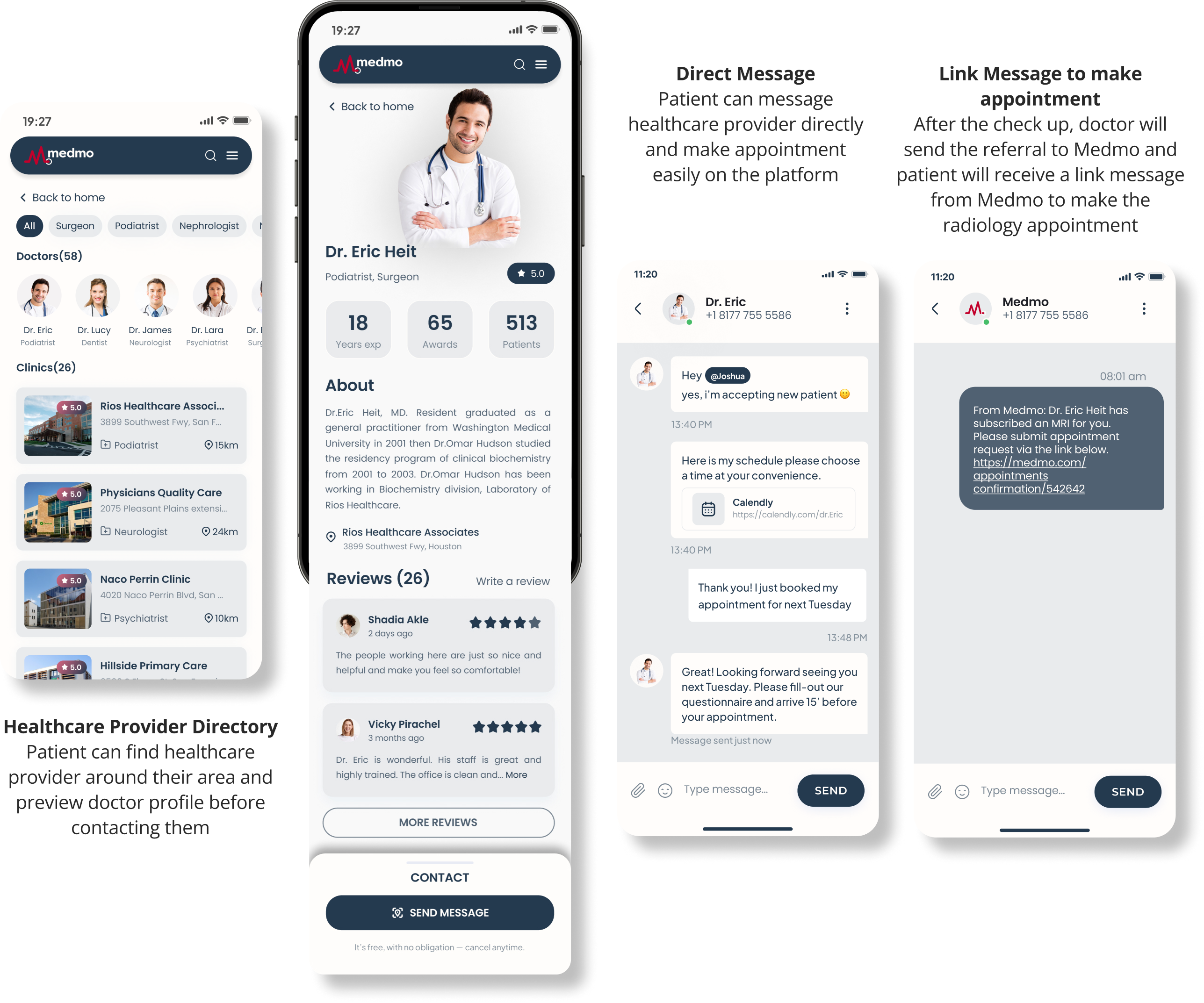
To improve communication and create a sense of community, patient now can find doctor to get referral and receive result feedback without leaving the site. In the future, they can also get a second opinion from another provider easily on the site.

After the scan, results are sent to the patient's doctor, and users are notified for review. Users can also leave feedback post-scan.

In the beginning, Medmo was not expecting a whole desktop and mobile refresh when we joined the team. With sudden interest for series A and further user research proven that the drop-off issue is far beyond the ordering design, my team and I was trusted by client to expand this project.