TL;DR
Booking a medical scan can be a real hassle. Prices aren't always transparent, it's hard to find a time that works, and users usually need a doctor's referral just to get started. Some people don't even know where to go or feel unsure about using online tools.
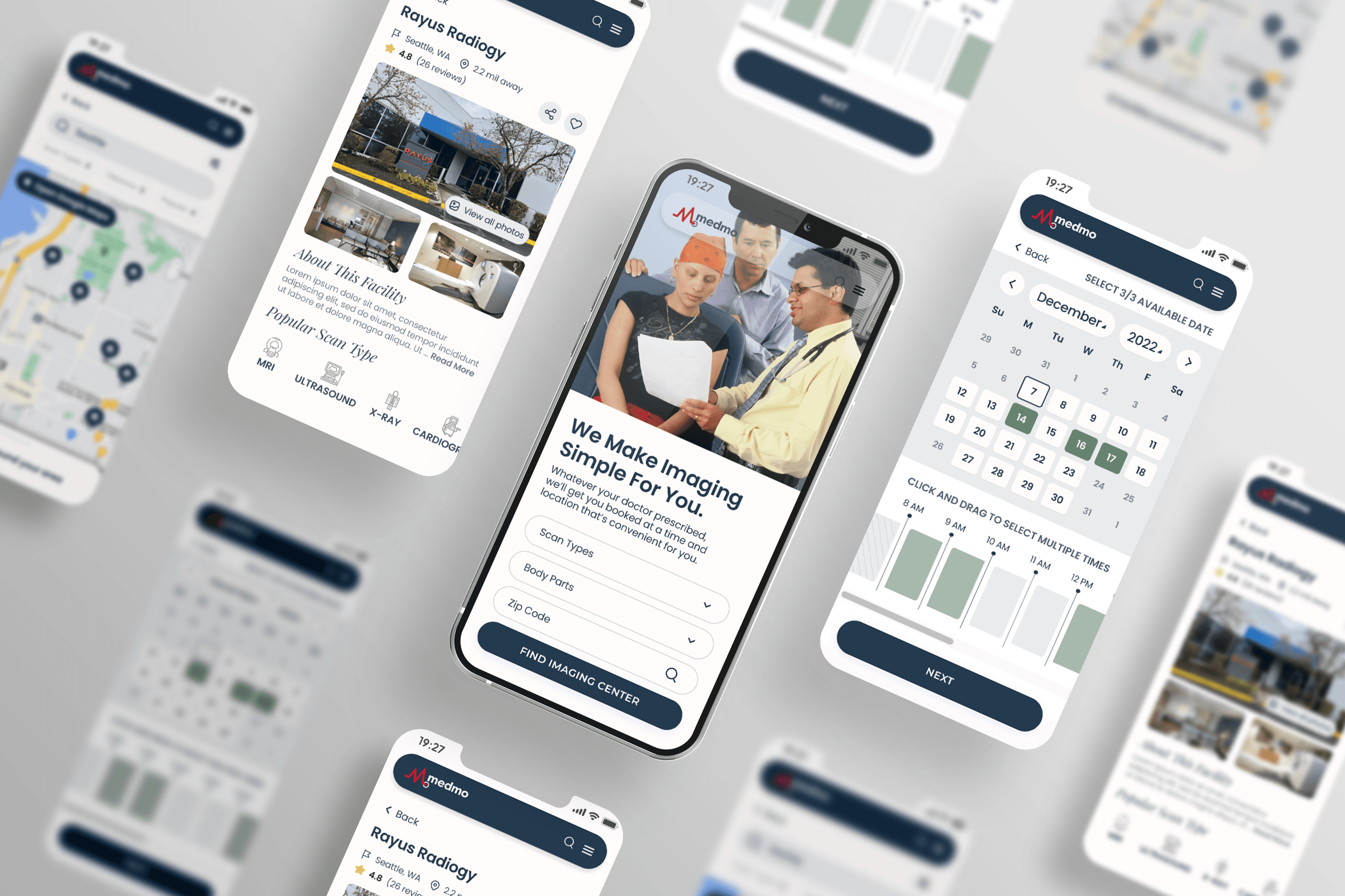
Medmo makes medical scheduling easy by helping users find trusted imaging centers that fit their schedule, location, and budget — all in one simple and secure place.
Patients struggle with complex appointment booking systems, unclear pricing, and confusing insurance requirements. Many find it difficult to compare options and navigate the process efficiently.
How might we help Medmo streamline the ordering process and build trust with patients?
Approach
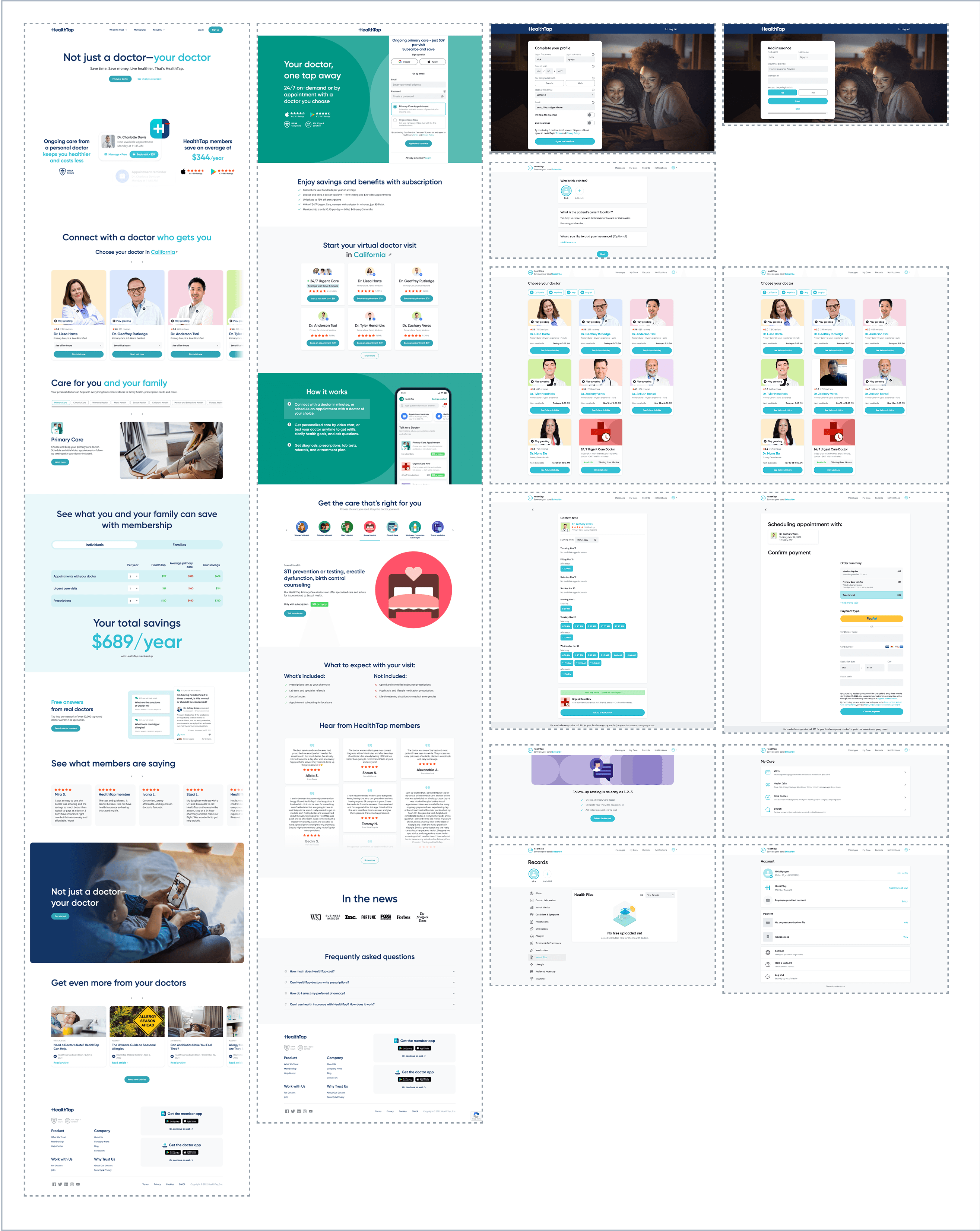
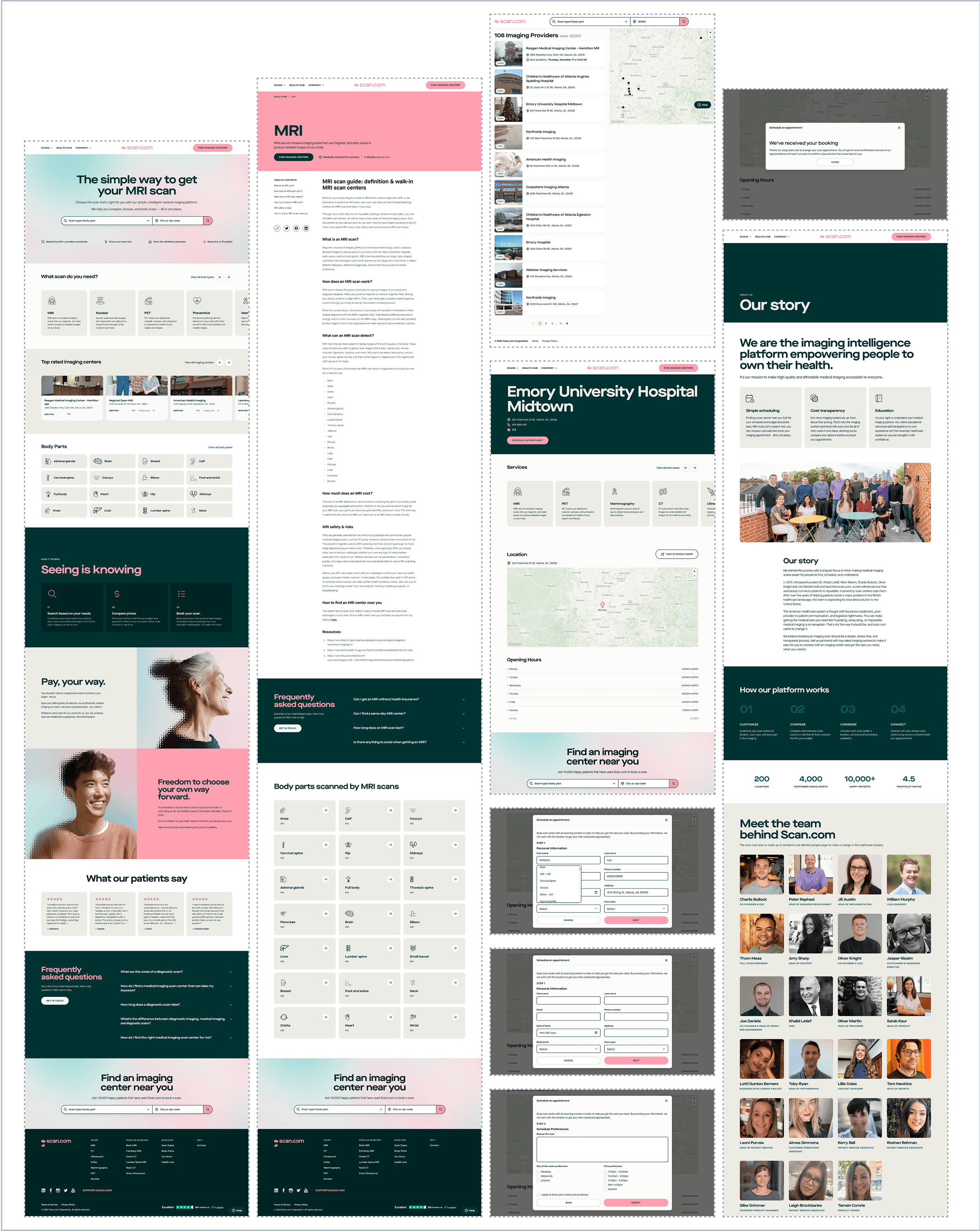
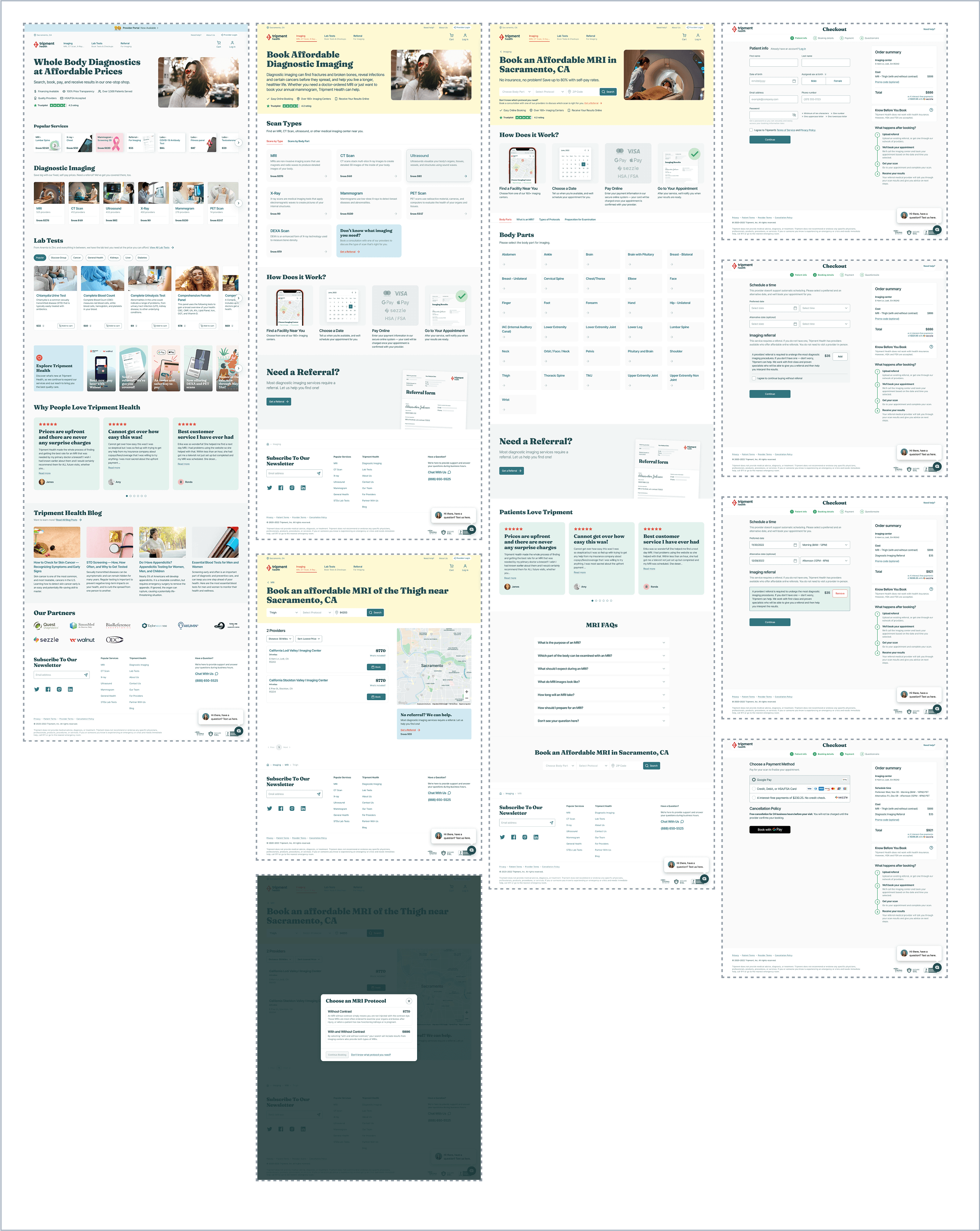
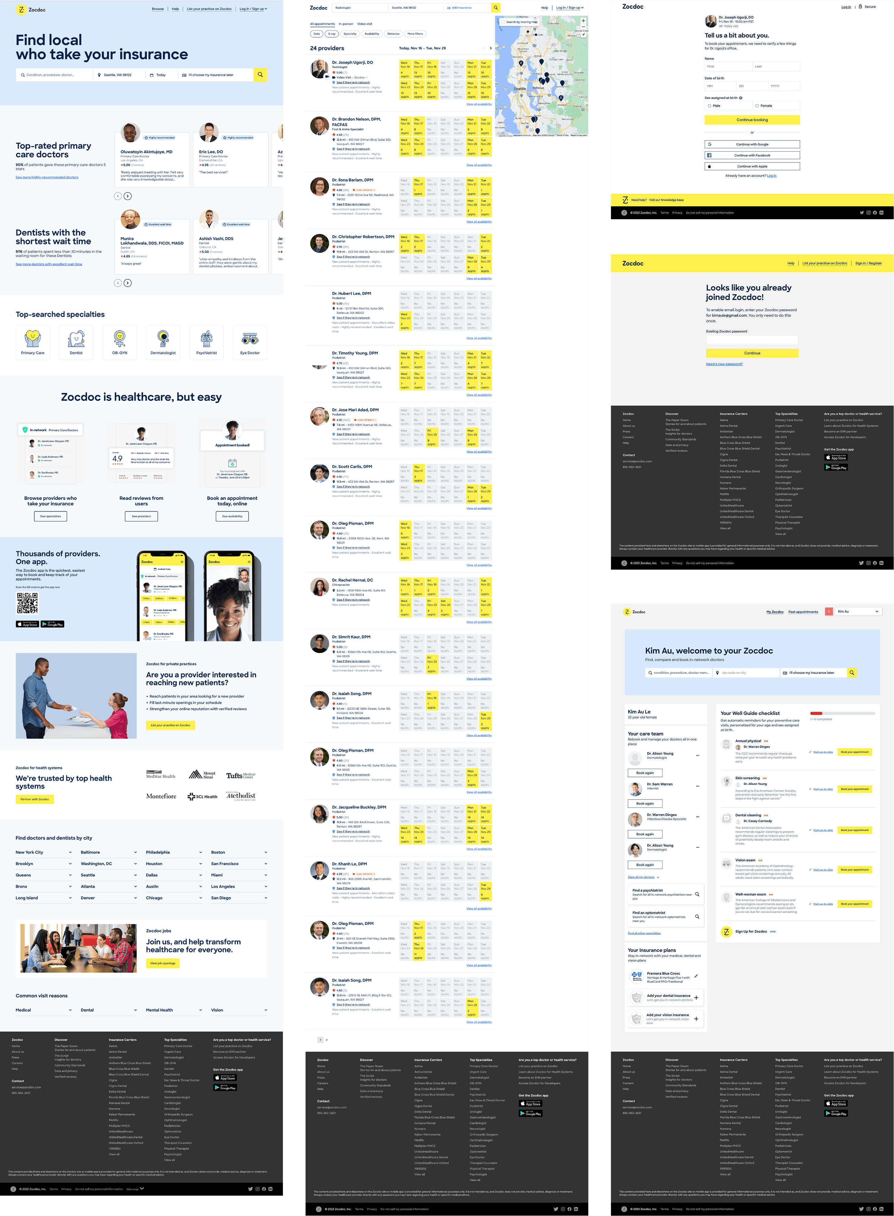
To understand the broader landscape and identify opportunities for improvement, we conducted a competitive analysis. We reviewed 5 key players in the medical appointment and imaging space, along with a few from adjacent markets. I also analyzed user reviews to gain insight into what users liked, and what frustrated them.
By analyzing these platforms, we identified common strengths — transparency, visual design, trust-building — and areas where Medmo could differentiate and improve the patient experience.
Highlights patient reviews and introduces doctors through short videos, making the experience feel more personal and family-friendly.
Stands out with strong branding and inviting visuals. Uses icons to represent body areas and features photos of provider locations to build trust.
Known for their detailed body scans and transparent pricing, which helps reduce user uncertainty about the platform.
Offers real-time scheduling, patient reviews, and ratings. It includes provider zip-code-based search and a personal dashboard for patients.
To better understand the current user journey, our team began by mapping how the platform functioned before, during, and after the ordering process. We wanted to see not just how the system was structured, but also how patients interacted with it at each step.
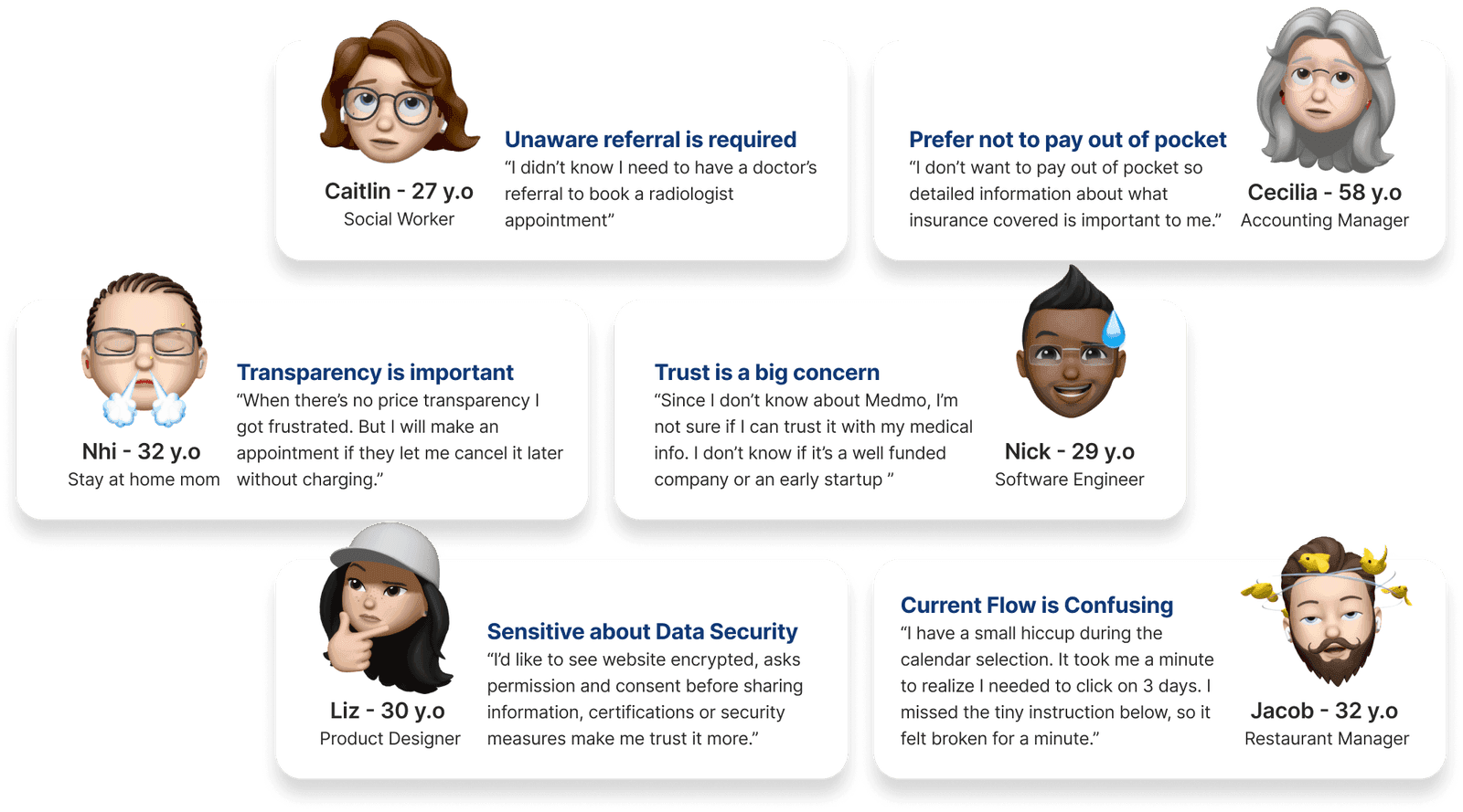
We conducted interviews with different user groups and distributed a survey to gather broader insights. After synthesizing our findings, we identified key pain points and reframed them into design opportunities.
Conceptualize
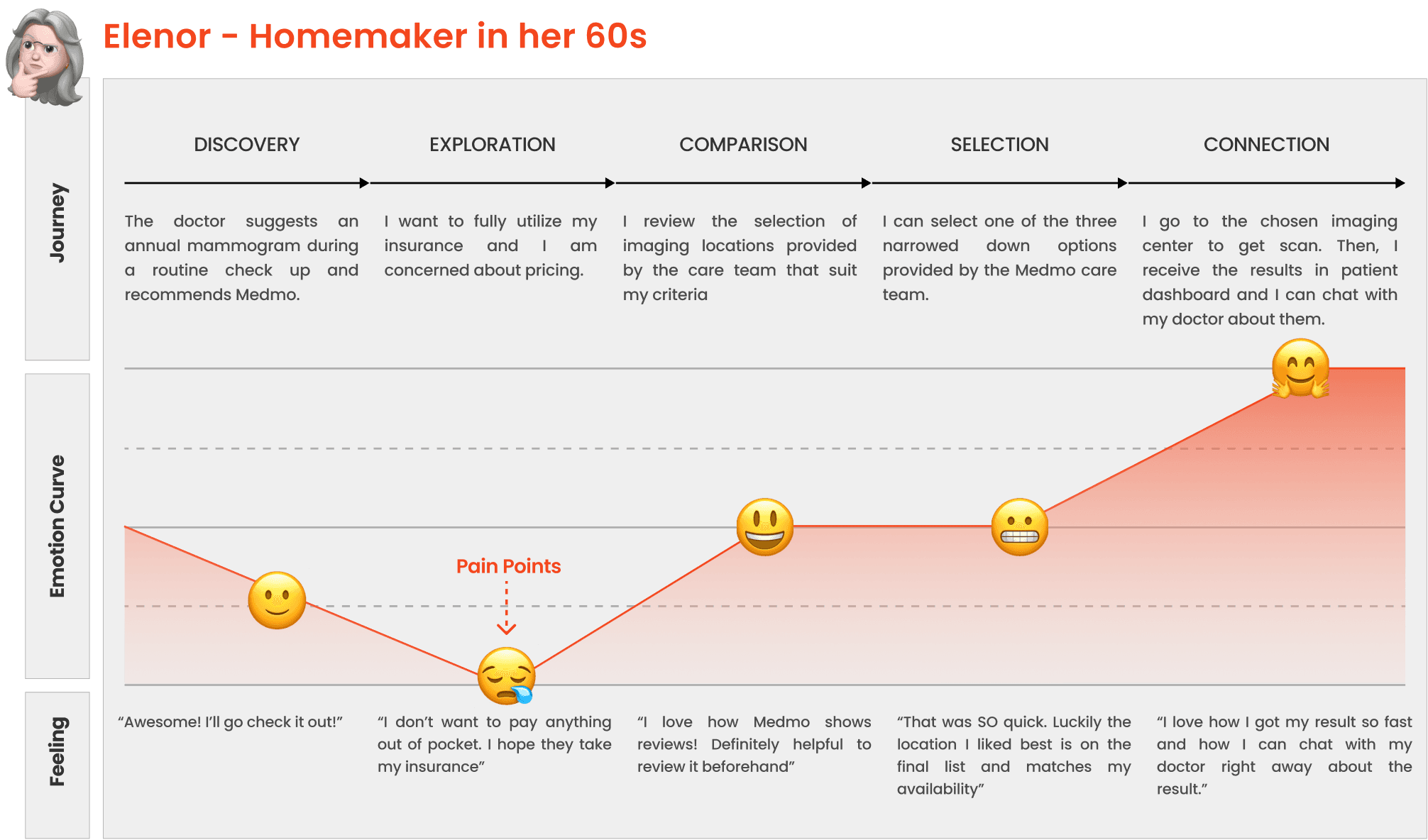
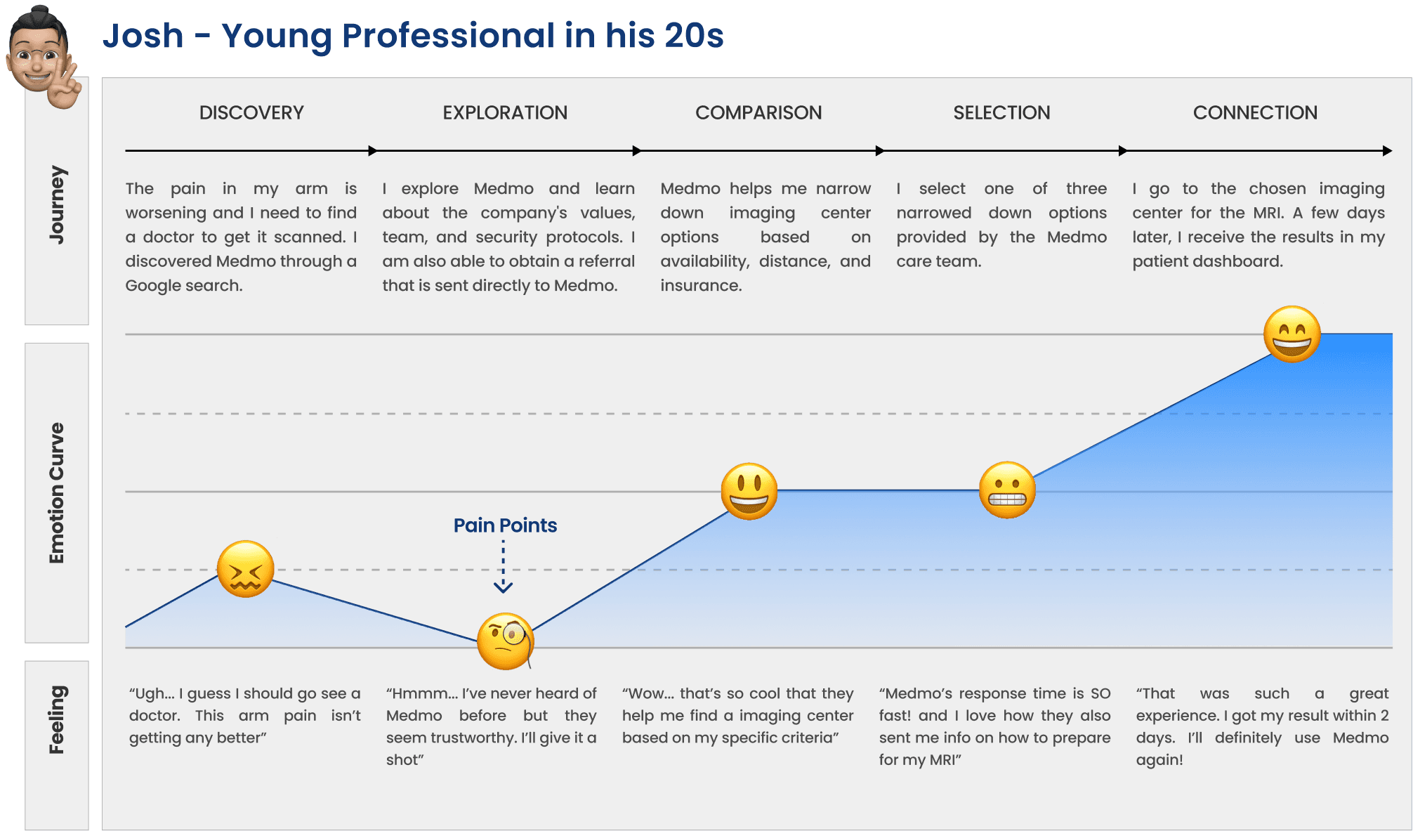
From our research insights, we created two primary personas to represent our target users.
A homemaker in her 60s who has been seeing the same doctor for years. She trusts his recommendations and distance is not a major concern — she prioritizes finding affordable prices.
Frustrations: Doesn't want to pay out-of-pocket; frustrated when there's no price transparency; doesn't trust new companies easily and isn't very tech-savvy.
Goals: Check if the procedure is covered by insurance; easy way to book and get reminders; multiple trusted radiology center options.
A young professional in his 20s who found Medmo on Google search. He values his time and is concerned about his personal data, wanting to ensure the platform keeps his information private.
Frustrations: Doesn't like to share personal details online; needs an appointment that fits his busy schedule; doesn't like sketchy websites.
Goals: Find a radiology facility that matches his schedule; best service (willing to pay more); all information upfront about his appointment.

We then mapped out user flows based on the typical actions each person would take — from discovery and appointment request to booking and follow-up. These flows highlighted points of friction and allowed us to ideate improvements.

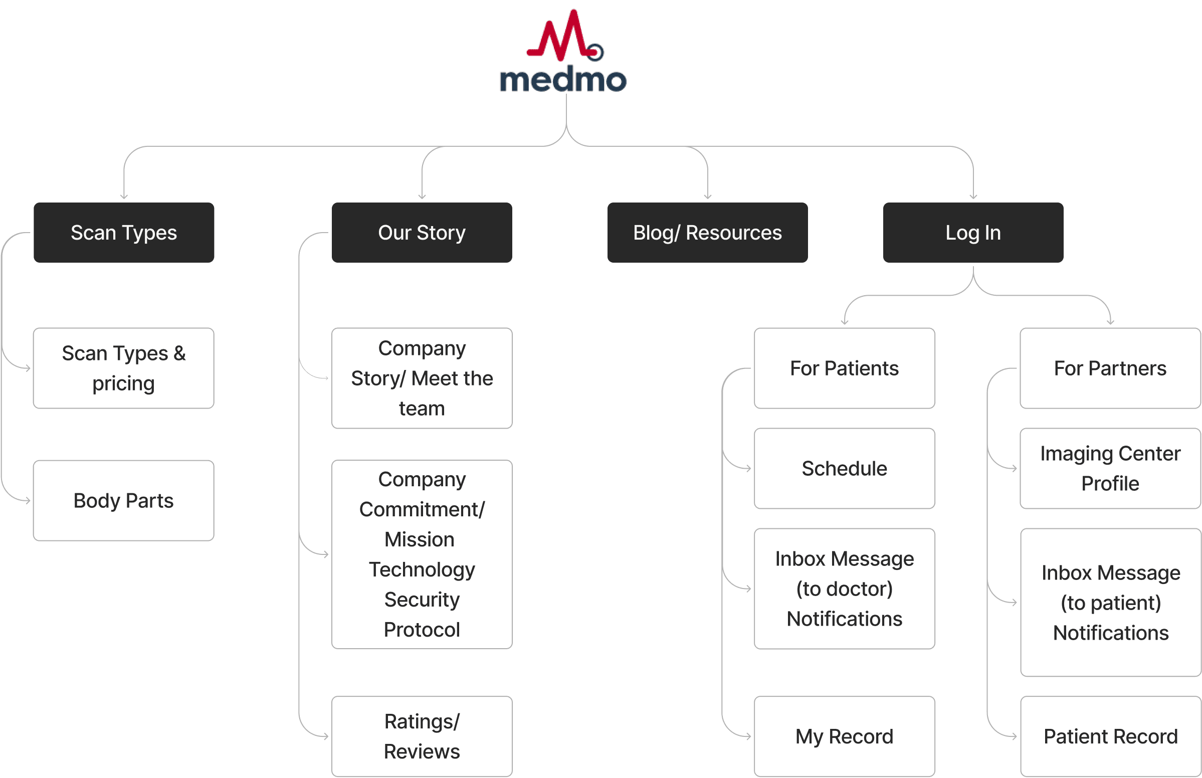
After generating our main user flows, we expanded outward and began thinking about the structure of the whole platform. Below is a map showing the hierarchy of pages on the platform.
Design
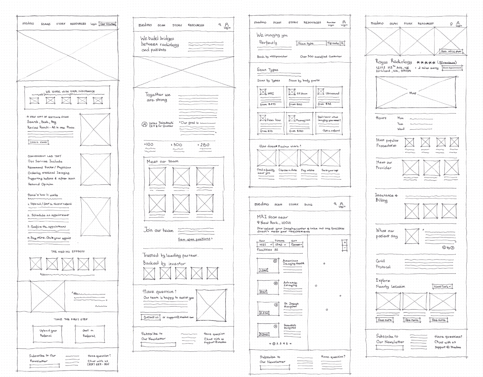
We then independently came up with ideas and sketches around the how-might-we statement. We regrouped, down-selected, and explored compound solutions — how could we combine our individual concepts into an even better compound service?
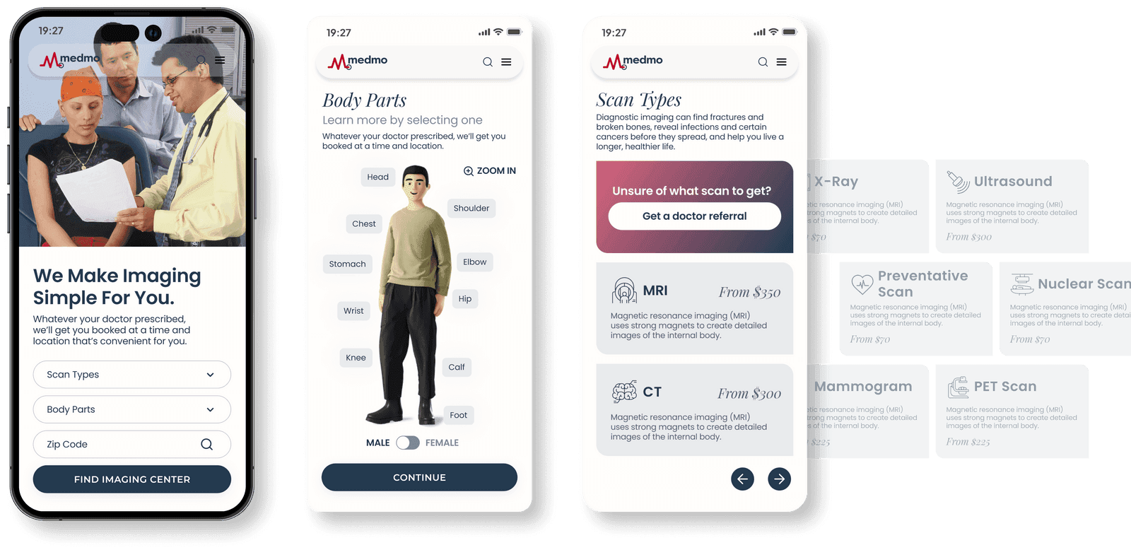
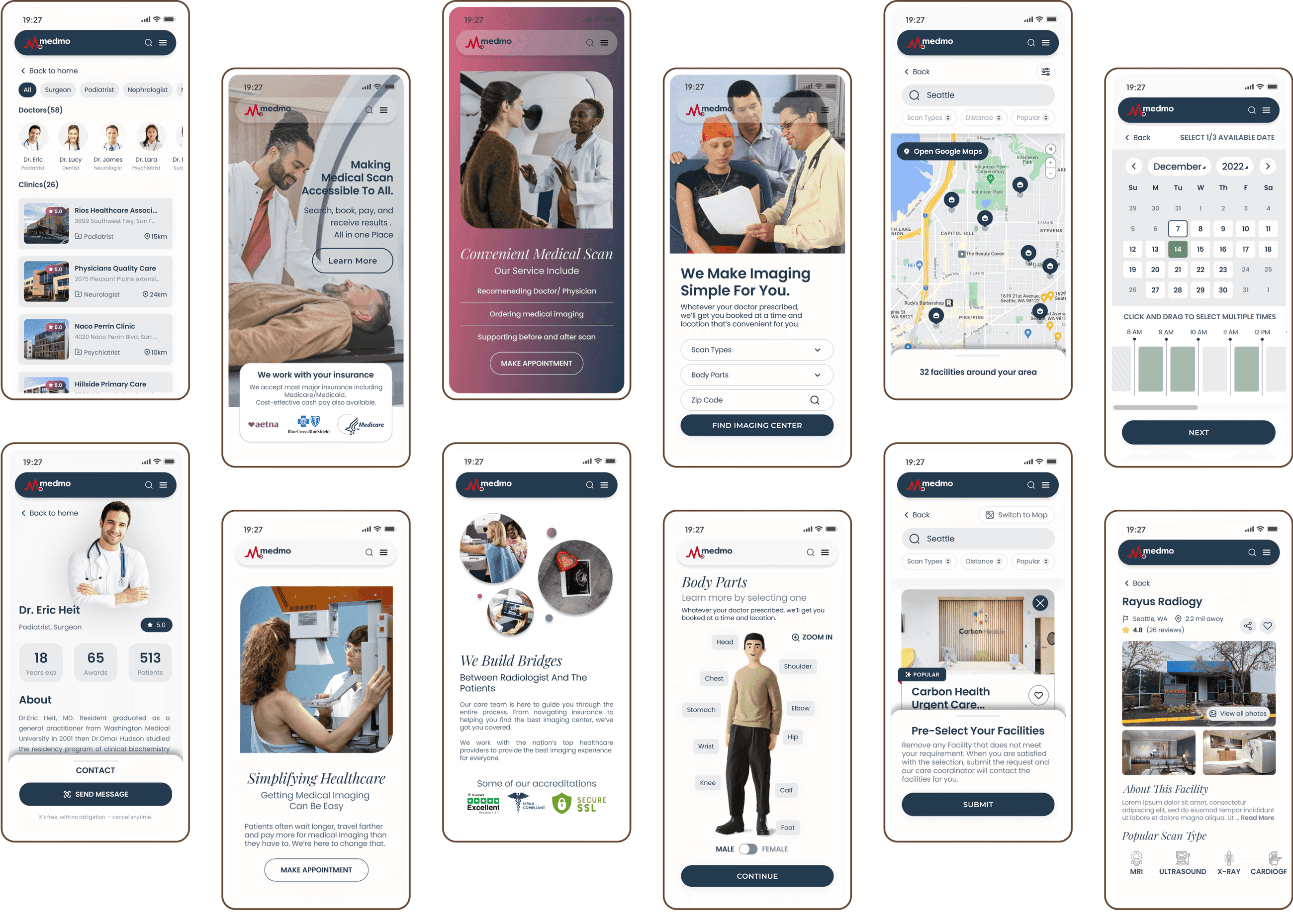
The new design for Medmo clearly outlines the required steps for scheduling a radiology appointment — including the need for a doctor's referral, insurance information, and necessary documents. It highlights the benefits Medmo offers, provides clear instructions and pricing, and shares positive statistics to build trust.
Problem: Most users don't realize they need a doctor's referral before booking. Solution: The redesigned home tab clearly explains what services are included, what insurance information is needed, and what documents to prepare.
Problem: As a new startup, Medmo needs to build credibility. Solution: The About tab now includes the company's story and mission, introductions to the team, and partnerships and affiliations.
Problem: Patients often feel anxious or unsure about procedures. Solution: We added clear, step-by-step explanations for each scan type — what to expect, how to prepare, plus visual aids and simplified language.
Problem: Users don't realize they're selecting preferred time slots for a request, not a confirmed appointment. Solution: We clarified it's a request, let users choose up to three preferred slots, and send confirmation via text.
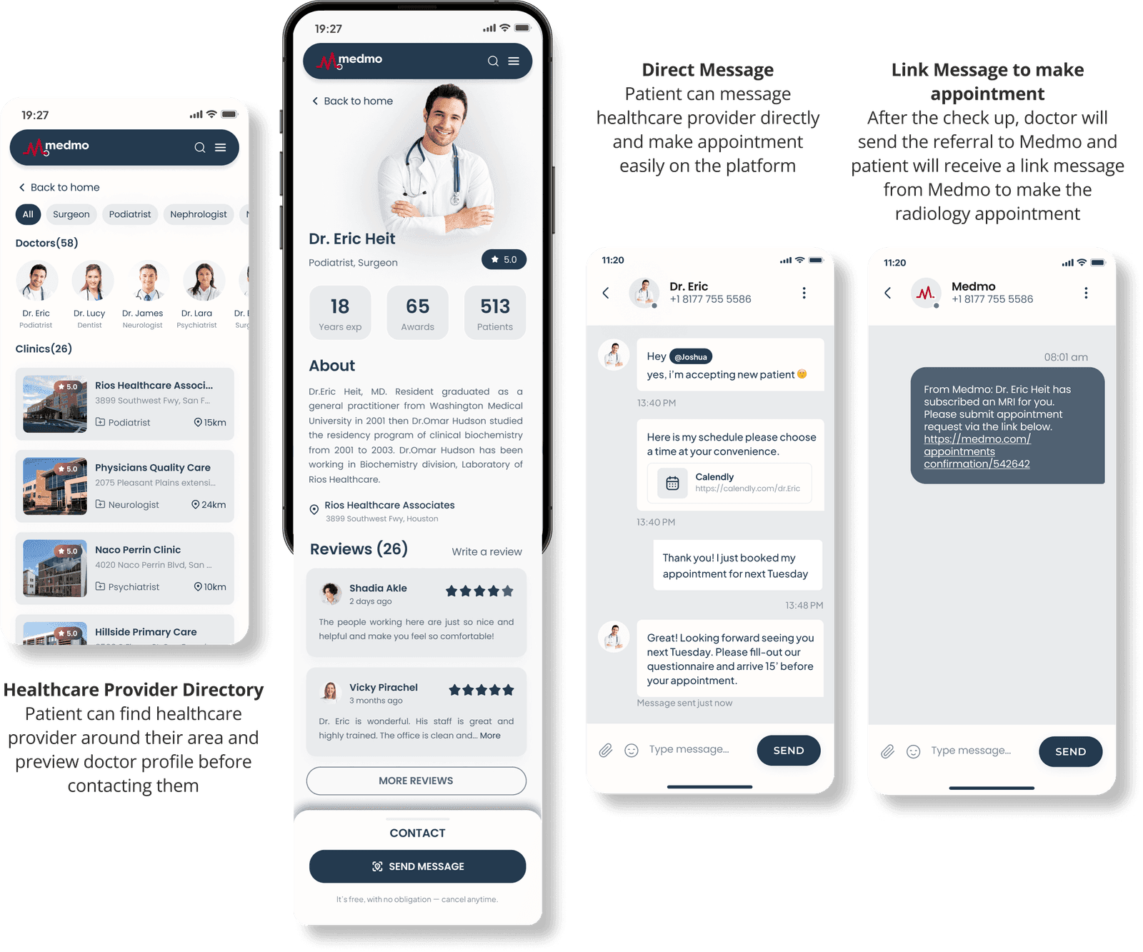
Problem: Patients struggle to find a referring doctor and leave the platform to follow up. Solution: Expanded provider profiles let patients find a doctor for a referral and receive results in one place.
Problem: Patients feel disconnected after their scan. Solution: We notify users when results are sent, let patients track results, and offer the option to leave feedback.
Impact
My Takeaways
When we were first approached by the Medmo team, they weren't expecting a full redesign across both desktop and mobile. But as user research and a sudden push toward Series A fundraising unfolded, it became clear that the drop-off issues went far beyond the ordering flow. With that insight, the client trusted us to expand the scope and take on a much larger challenge.
This project taught me how to navigate ambiguity, adapt as we learned, and stay flexible through shifting goals. Being involved in every stage — from research to presenting to stakeholders — helped me grow as a designer and feel confident tackling bigger challenges ahead.
I am currently looking for a team where I can take part, learn from, and become a better designer (/human).
Let's Chat! ↗